
Best Practices For Conversion Rate Optimization – Part 1 of 6
Last week, I discussed what Conversion Rate Optimization is and why it is one of the most crucial processes of Growth Marketing. Today I will be listing down the best practices for conversion rate optimization.
I searched for meaning for Best Practices, and the definition that I got on the first page states, “commercial or professional procedures that are accepted or prescribed as being correct or most effective.”
Best Practices In Marketing
Best Practices in any industry are achieved based on data drive analysis. Mostly marketers draw inspirations from related websites, renowned web designers. However, implementing them based on confirmation bias is not a good idea.
If your goal is to design a highly convertible landing page, there are an infinite number of ways to achieve that. There are several guides to create a landing page, and you can always take them as inspiration. But, even the best practices has the room for experimentation & interpretation for them to work effectively in your case.
Best practices are an excellent point to start, but keep the room for improvement backed by the data drive approach.
Before we dive deeper into the Best practices for conversion rate optimization, I would like to mention that the following content is based upon the learnings that I did during the Second Week of Conversion Optimization, my nano degree course at CXL Institute, led by Peep Laja & team.
I will be dividing the practices into six parts to ensure maximum readability & thorough understanding.
WebForms

Whenever we think of conversion, forms are the necessary steps to optimize. We use them for a variety of purposes.
- Sign up forms
- Checkout forms
- Payment forms
- Quote request forms
- Lead generation forms
When we talk about optimizing the forms, we mostly focus on reducing the friction to ensure a smooth & precise flow for the visitor filling the form.
Set Clear Expectations
Let’s consider a step by step procedure. You want to try out a new SaaS tool, and you visit their website. There is a form to sign up for Free Trial. The journey will be somewhat like this.
- Visit the website
- Search for the Sign Up option.
- Signup/Login with Google or any other provider, or fill in your details.
- You see the Payment form with Visa, MasterCard & PayPal icons.
BOOM, you instantly drop-off, as when you clicked on Free Trial Sign Up, Credit Card requirement was not mentioned. There will be huge drop-offs if you put a one-liner, Credit Card Required. Or maybe write to No Credit Card Required to encourage signups.
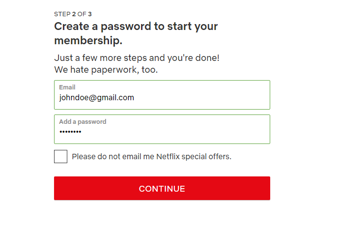
Minimize The Number Of Form Fields
One of the standard best practice is to only ask for information that is required. Marketers need to get over their Greedy Marketer Complex.
Another Best Practice is to avoid optional fields if you don’t need them.
You certainly don’t them to fill Mr, Mrs, or Birth-date if the purpose is to buy a PDF from your website.
Sometimes, you might need some optional fields. As I stated in the start, even the best practices need to have experimented.
Intentionally Increase Friction To Improve Lead Quality
Sometimes, increasing the number of fields helps in getting a better quality of leads. You only et people who are more motivated towards the objective of form. Since long forms contain a lot of information, it’s easier for you to segment them.
Lastly, long forms filter out the unqualified people already, as they do not fill the complete form.
Multi-step Forms
There come such situations where removing the fields is not an option. Either you have to skip some crucial form fields, or you can reduce the perception of friction.
You can achieve this by splitting the form into multiple short steps. Another strategy is to get more of the vital information in the first step, such as name, email & phone number. Now even if the person doesn’t’ complete the second step, you can still follow up on them.
Alternatively, you can break the form into sections too, which might reduce the perceived hassle.
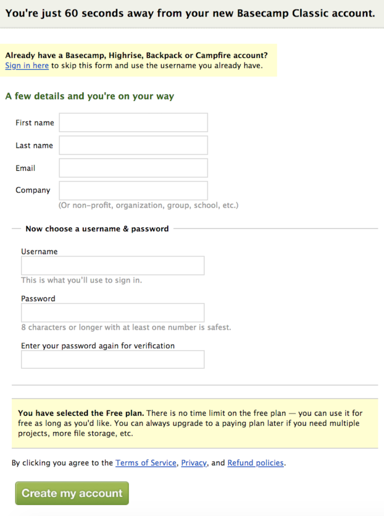
Start With Easier Fields.
Always start with easier fields, so the person builds momentum along the way, and the chances to complete the form increases.
Most of the time, you can use dropdowns & radio buttons to ease the process too. A simple tactic is to use radio buttons when people have less than five choices, such as gender selection. However, go for dropdowns if there are more than five choices. You should also use smart fields such as country search & select, so the person doesn’t have to search manually through the options.
Pre-select What You Can
As I discussed smart fields, there are various ways to auto-populate the fields. You want people to fill in their location, try getting that via their IP Address. In the US, most of the time, the city & state are auto-filled when the person inputs the zipcode.
Feedback And Error Validation
This one is important. Every time, you show the correct error or feedback to the visitor, you are scoring huge gains.
The priority is to create intuitive forms that have real-time in-line validation for feedback. It happens a lot of time that the phone number doesn’t get accepted because it isn’t correctly formatted.
Let people enter data; however, they want. If you want it in a particular format, that formatting should happen in the backend, done by your code. (spaces and dashes welcome!)
Avoid Captchas

After testing more than 1,100 people, gathering 11,800 completed surveys, and studying 14,000,000 samples from a week’s worth of data from eBay, a study carried out by Stanford University into the use of CAPTCHA by humans, revealed just how difficult CAPTCHA has become for humans. The study showed that on average:
- Visual CAPTCHAs take 9.8 seconds to complete
- Audio CAPTCHAs take much longer (28.4 seconds) to hear and solve
- Audio CAPTCHA has a 50% give-up rate
- Only 71% of the time will three users agree on the translation of a CAPTCHA
- Only 31.2% of the time will three users agree on the translation of an audio CAPTCHA
Address FUDs (Fears, Uncertainties, Doubts)
Whenever a visitor is asking for sensitive information, it creates resistance to fill the form. The strategy is to avoid all the possible FUDs (fears, uncertainties, doubts), and then address them one way or another in the form to reduce friction.
You can put keywords that encourage safety or try putting badges & seals from verified third-party tools. You have to test & figure out what works best for your audience. Mentioning Safe, Secure, Privacy Protected can give a sense of security to the person filling the form.
Form Analytics
There are three ways to assess your current forms & friction.
- User testing, to identify the resistance
- Screen recordings (using Hotjar or Inspectlet)
- Form analytics tools
As designers and optimizers, it’s our responsibility to embrace the power of forms, to optimize them, and ultimately to get higher conversions out of them.
Buttons And Call To Actions
How likely visitors are to take action depends on whether
- they notice the CTA begin with,
- the next step is obvious and makes sense, and
- they see value in the next step.
To make the CTA noticeable, we will go through some of the basics.
One Primary Call To Action
For every page, you should identify a single button to progress towards your primary goal. This doesn’t mean you can’t have secondary CTAs, but those need to be secondary in prominence too & less dominating.
Check this example at Nonfig, notice the difference between the primary & secondary CTAs.

Button Is Usually Better Than Link
Buttons come in all shapes & sizes, whereas links are not so noticeable. So the use of buttons is encouraged. However, there might be scenarios where the link is essential to ensure the dominance of primary CTA.
Make It Big (enough)
Big Buttons drive more clicks. They are prominent and as per Fitt’s law, the bigger an object and the closer it is to us, the easier it is to use it.
Take a look at this example of the MeetEdgar landing page.

Use The Right Amount Of White Space
Anything that clutters your page has to be removed. CTAs can only be prominent if we provide an adequate amount of space around them. This ensures better visibility & a higher click rate. Make sure you are using a different colour for your CTA as compared to the website.
Use The Right Copy
Whenever you are writing the copy for CTA, ask yourself three questions.
- Is it specific?
- Does it convey a benefit?
- Does it trigger the user into clicking?
Protip: Don’t use a CTA like “Submit”. Very few people want to submit.
Fold And Page Length
Every time, a visitor visits your website, there is a specific top portion of the page, that gets displayed as a first impression. This top section or part is called fold. Everything you put in this section determines if the visitor will scroll down to the other content or not. Hence critical stuff needs to be above the fold to captivate their attention, ultimately ensuring higher conversions.
Fold 101
The term above the fold originated from the newspapers industry. Printing companies used to put the fresh content & creative headings in the top half, which is more visible to captivate the attention.
There is no specific length for this fold portion. It varies on devices and screen resolution as well. A common practice is to put the top 650–700 pixels for fold, considering the common desktop browsers.
Working With Fold And Long Pages
There is a lot of research on whether people scroll or not. Chartbeat, a data analytics provider, analyzed data from 2 billion visits and found that “66% of attention on a normal media page is spent below the fold.” — What You Think You Know About the Web Is Wrong.
Whenever you have to design a page, keep in mind to prioritize the content placements based on their importance. The least important information should always be served in the last, whereas most crucial information needs to be at the top.
You can use SessionCam for getting the scroll report for your website.
The Fold Isn’t Just For Home Pages.
As we talk about the fold, the best practices aren’t limited only on the landing page. The fold can be considered in several different scenarios.
- Checkout Page — users must be able to checkout without having to scroll to proceed.
- Cart Page — users can click on the CTA button easily; you can achieve this by putting two buttons. One above the cart, and the other underneath it.
- Pricing Page — users should be able to click on CTA from above the fold.
Alternatively, you can guide the user to scroll down to take any action.
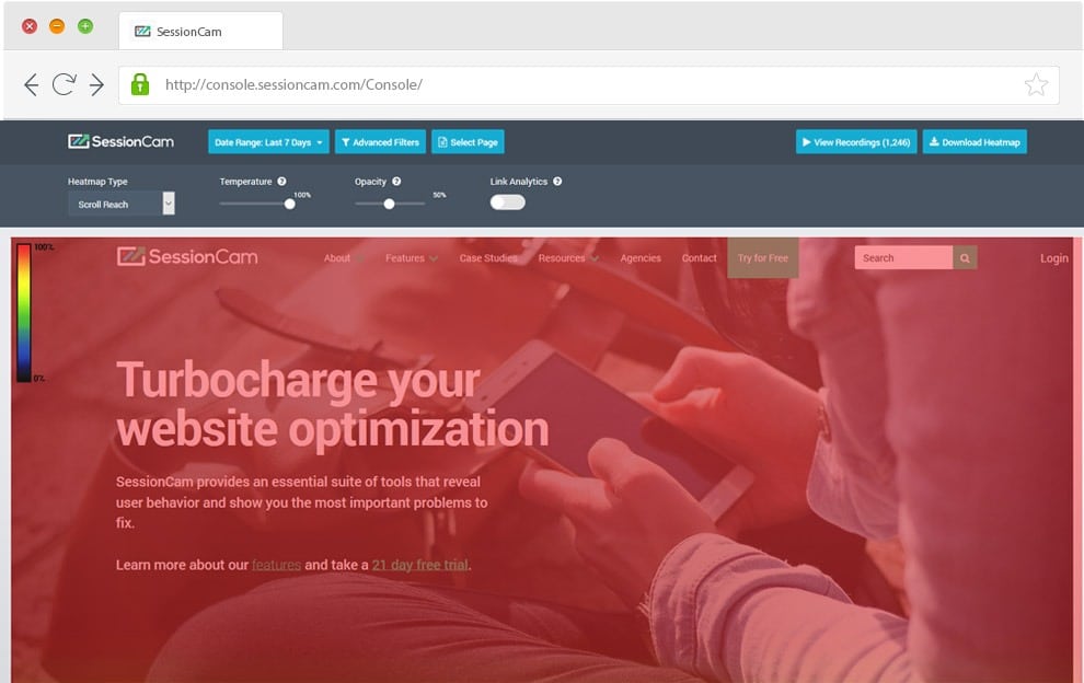
Image Courtesy: SessionCam
Ideal Page Length
The idea length is dependent on the objective of that particular page. Considering the transactional sites, you need to put content that intrigues the visitors to take the desired action.
There can be different criteria for choosing the length of the page. Page load speed, visuals, content, & navigation are a few factors.
This content is Part 1 of 6 blogs focusing on the Best Practices for Conversion Rate Optimization.
Have any questions? Feel free to comment down.
Great advice! Social proof is very valuable in getting visitors to
buy on your website.